What does it mean to design around the idea of a ‘surface’?
By Nazlı Ercan

I kept coming back to this question while working on the design of Kandis Williams: A Surface. Surface is fundamental to graphic design—a page is a surface, printing happens on a surface, layout sits on a surface. But in this case, I wanted to think more intentionally about what “surface” could mean in the context of this book, especially in a way that resonated with Williams’s practice.
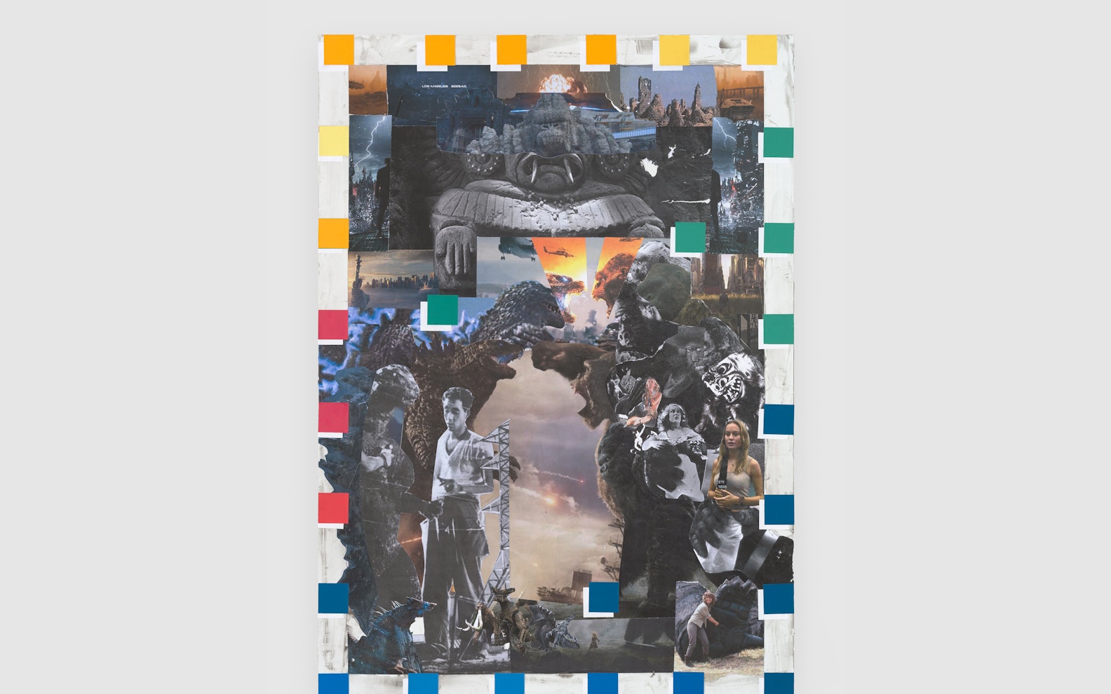
In Williams’s work, surface becomes a site of tension, a place where identity, particularly Blackness, is constructed, read, and challenged through layered, unresolved references. She brings together fragments from art history, pop culture, race theory, and politics. Her collage-based process doesn’t aim to resolve those references; instead, it holds them in friction. I wanted the design to emphasize that same sensibility: layered but unresolved, organized but open, informed but not overly polished.
Naturally, that started with the grid. When designing a book, it’s not a surprise that, as designers, we begin with the basics: how many columns and what margins to use? But the more time I spent with the content, the more I found myself thinking about the art historical and mythological figures that show up in Williams’s work. These led me to think about the grid itself as a kind of structure that reflects the “Western canon” in graphic design—rational, ordered, and slightly authoritative. I found a layout from the book Electronic Landscapes, designed by Wax Studios, that I quite liked: a loose, responsive structure that still held the content together. I wanted a similar grid that could stretch, shift, and move. I was interested in making something that felt active rather than static.
That desire to both follow and break the grid brought me, circuitously, to Jan Tschichold’s The Form of the Book. In his writing, Tschichold lays out a strict approach to design with precise grids, clear hierarchies, and ideal proportions. At one point, I was looking at a diagram from the book, trying to recreate his exact page ratios. I started with 8 inches for the width, which gave me a height of 12 inches, but that proportion quickly felt too traditional—what I was trying not to do, but push against. So I shortened the page height by an inch but kept the structure: the margin rules and the underlying geometry. I built a 9 x 9 column and row grid that retained the classical feel but made room for greater flexibility. That mix of order and looseness felt like a good parallel to Williams’s own practice, where she draws from classical references but pushes them into conversation with contemporary material.

That same thinking carried into typography. I started with the body typeface, not the display face, because I was more focused on how the text could live dynamically across the page. I wanted something grounded but soft, with just enough irregularity to feel human. I tried Sabon, but it felt too stiff. I tried ABC Arizona, which was closer but not quite right. Then I found Feijoa from Klim Type Foundry. It’s a serif with a bit more weight and character, with slightly imperfect edges. It had the warmth I was looking for.

Once Feijoa was set, I moved on to the display type. Around this time, Mark Owens pointed me toward Hawthorn. I’d been researching horror movie title cards because horror is a recurring visual language in Williams’s work. I tried a few options, including Trajan, but most of these typefaces felt too on the nose. But Hawthorn worked. It’s sharp, a little funky, but still clean. There’s a curl in the “R” and other subtle quirks that pair well with Feijoa. Together, they had the contrast and character I wanted.


At that point, I had explored “surface” in terms of layout, but I started to think about it more literally: the material surface of the book. In book design, it’s common to ask whether sections of content should feel distinct or not. Should each section use different paper stocks or varied layouts? Or should they all match? This book had three: the front/back matter, the commissioned essays, and a reference section of found texts compiled by curator Taylor Jasper. Initially, I thought about using different materials for each section, but that approach started to feel too heavy-handed. Instead, I opted for tonal shifts—variations in the black-and-white spectrum.
The beginning and end of the book are printed with black backgrounds. The essays sit on a mid-tone gray. The plates are printed on white. It’s a subtle progression, but it felt right and aligned with Williams’s approach to exploring Blackness in layered and shifting ways.

Outside her visual art, Williams also runs Cassandra Press, a publishing platform that focuses on Black theory, aesthetics, and politics. In early conversations, she made it clear that she didn’t want this book to reference Cassandra Press visually, but that it could engage with that part of her work conceptually. Including the reference section was one way to tie the book to Cassandra Press without replicating the design of Cassandra readers. That section uses Holmen Book, a newsprint-style stock, while the rest of the book uses Munken Lynx paper. I also introduced a new typeface—ABC Marfa, a sans serif—just for that section. These shifts created a clear distinction while everything still felt like part of the same design language.

As I kept thinking about tone and texture, I found myself wanting to restrict color even further. Outside the plate section, all images are printed in black and white. The plates are the only part that uses full color. That choice made sense as it reflected the aesthetic choices of Cassandra readers, which also are printed in black and white.
Then I turned to the most literal interpretation of surface: the surface of Williams’s artworks. Each section opener in the book features a black-and-white, zoomed-in crop of one of her pieces, retouched to highlight texture. It was a way to ground the book in the physicality of her work and remind readers that this is a physical object. I also liked the decision to label sections simply as “Text,” “Image,” and “Reader.” That directness felt right; it mirrored the tone of Williams’s work, layered but legible.

Once the interior was locked in, the cover was the last element to figure out. I had originally considered using multiple print techniques throughout the book, but in the end, the cover felt like the more appropriate place for that kind of treatment. Because the book has three main sections—essays, plates, and reference—I used three different print processes on the cover: silkscreen (for a textured shiny backdrop), foil (for the title), and CMYK (for the image tip-in). The title appears only on the back cover, leaving the front image-only. That felt important. By withholding the title, I wanted the reader to first encounter the book on its own terms—as a surface—before anything else.

In the end, I wanted to make a book that explores the idea of surface through graphic design. A book that reflects the layered and textured nature of Williams’s work visually and conceptually. One that is structured but responsive, that encourages navigation rather than passive reading. A book where surface isn’t just decoration but a fundamental part of how meaning gets made.▪︎

Experience the work of Kandis Williams for yourself. Now on view through August 24, 2025.


